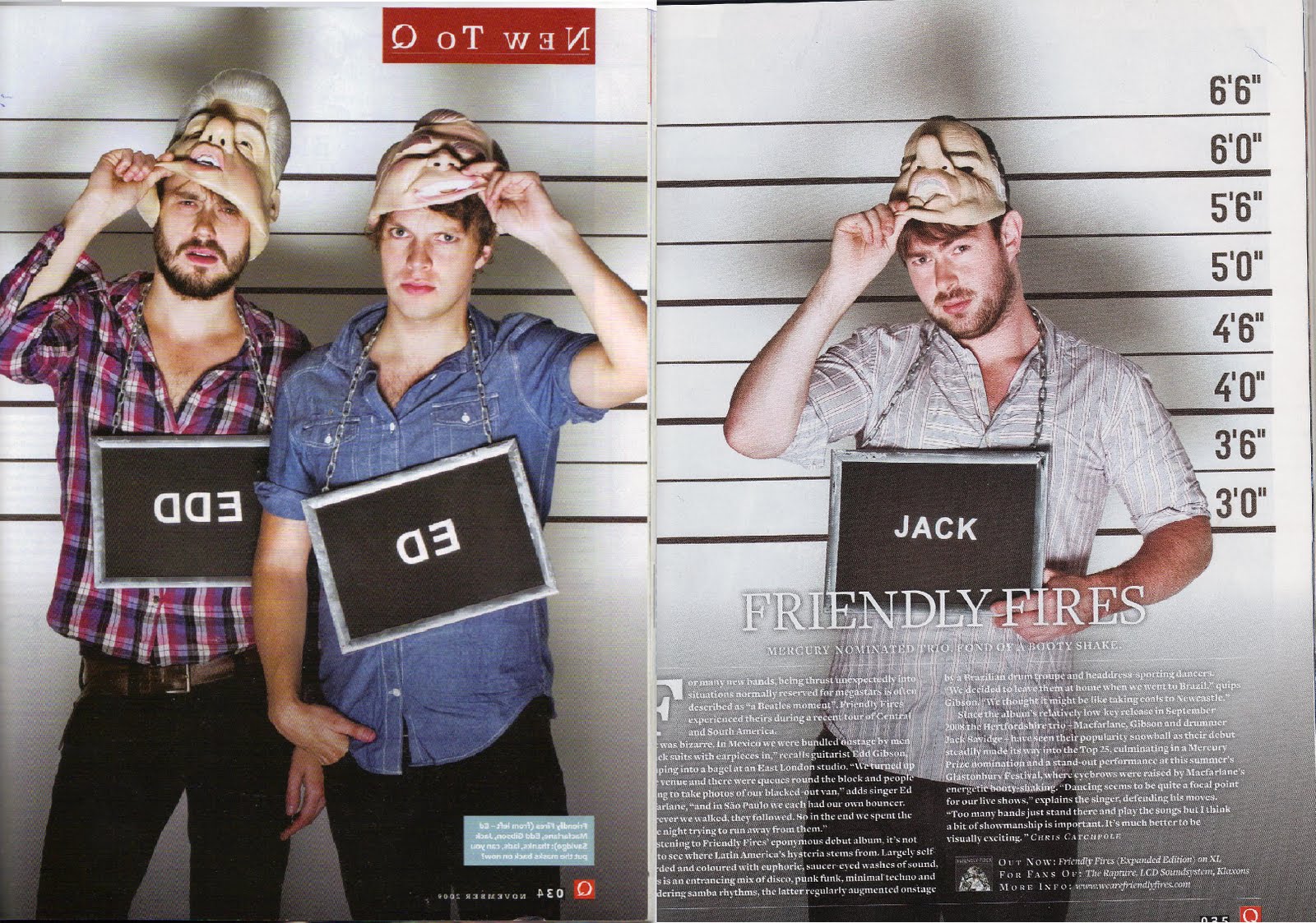
Music industry
View more presentations from danilian.
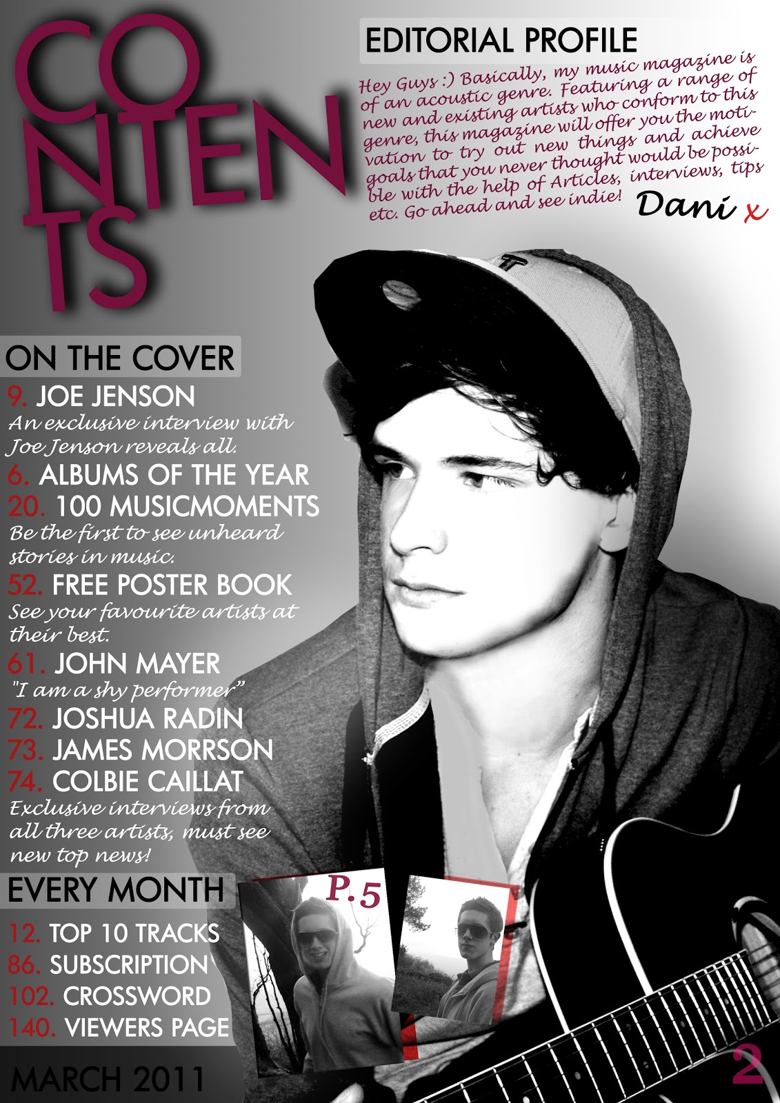
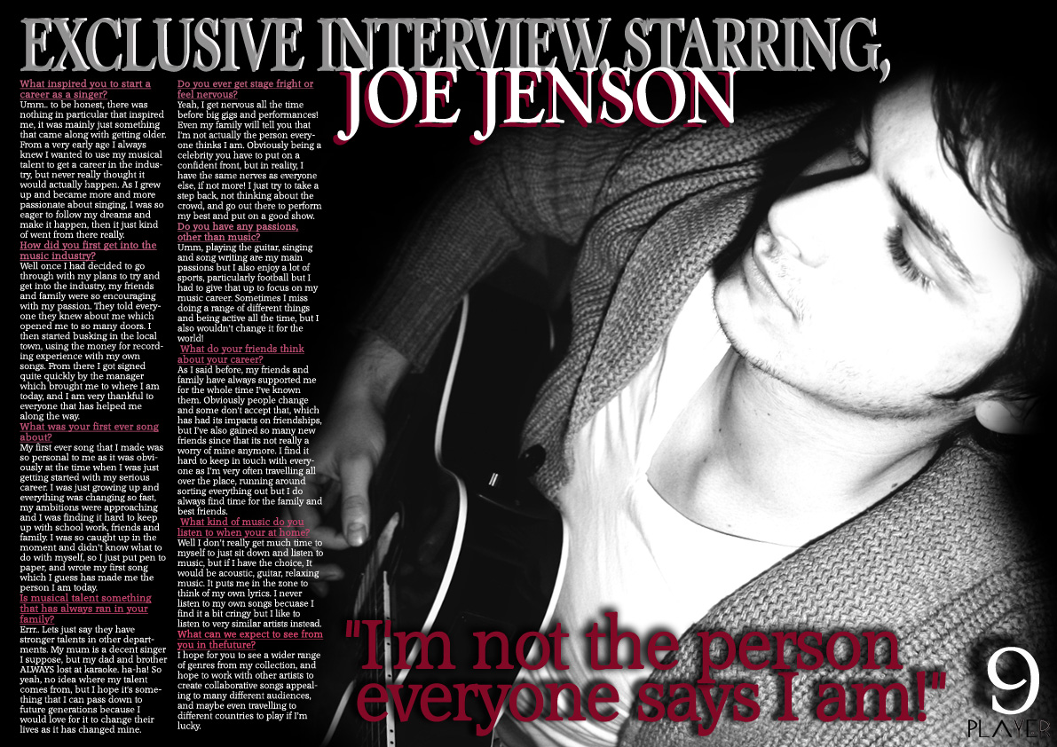
 I have created a target audience customer profile to show the type of person which I have made my magazine for. The main people I have aimed to target are people aged 14-19, both male and female.
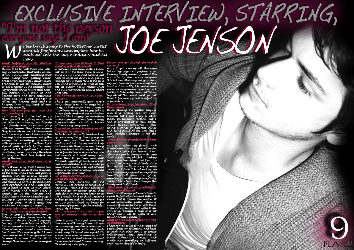
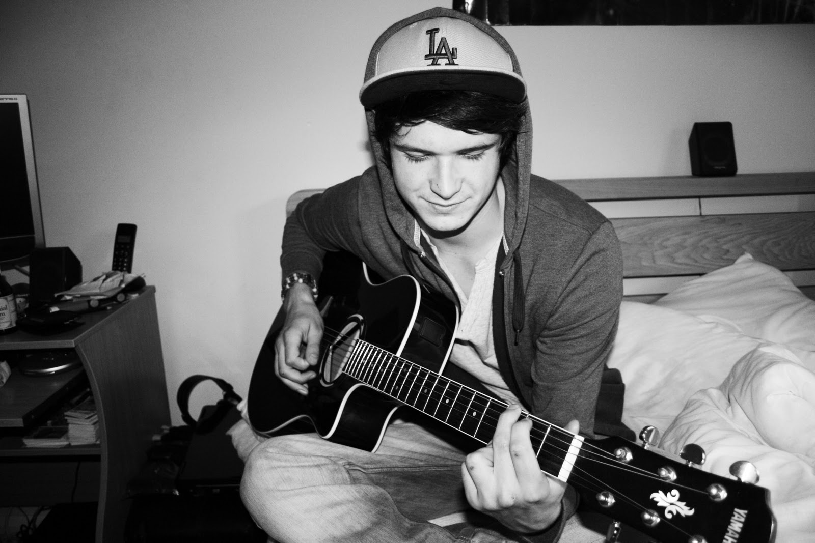
  She is a former student at college, studying Art, photography, and maths. In her spare time she likes to meet up with her friends, experiment with her camera taking photographs, and listen to calming acoustic music whilst doing her school work. She listens to artists such as; Colbie Caillat, James Morrison, Paulo Nutini, Joshua Radin, and Joe Brooks. She has a passion for playing the guitar, however could use advice and contacts to progress her talents further. My magazine is aiming to meet these needs for her and many other people in the same situation.


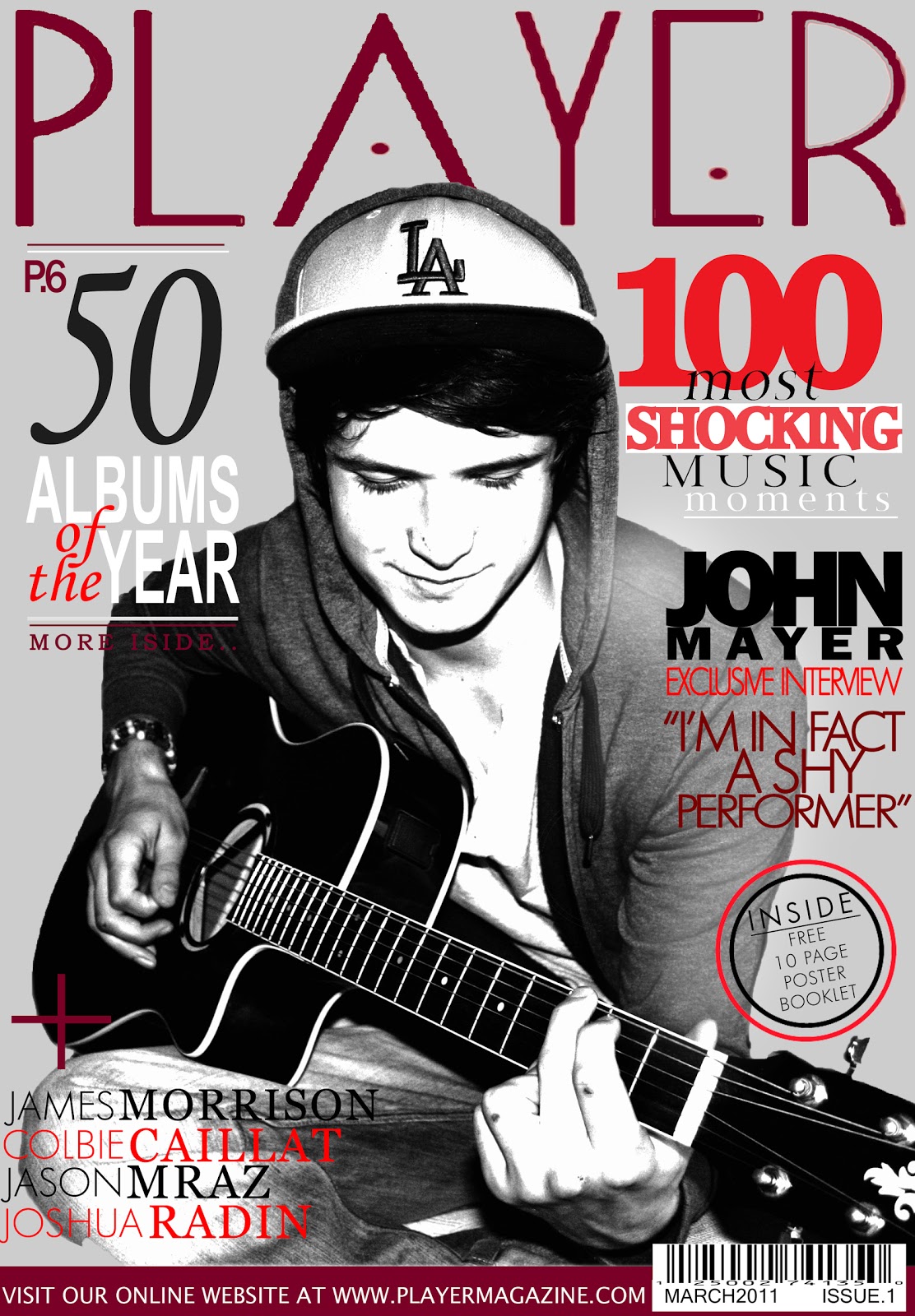
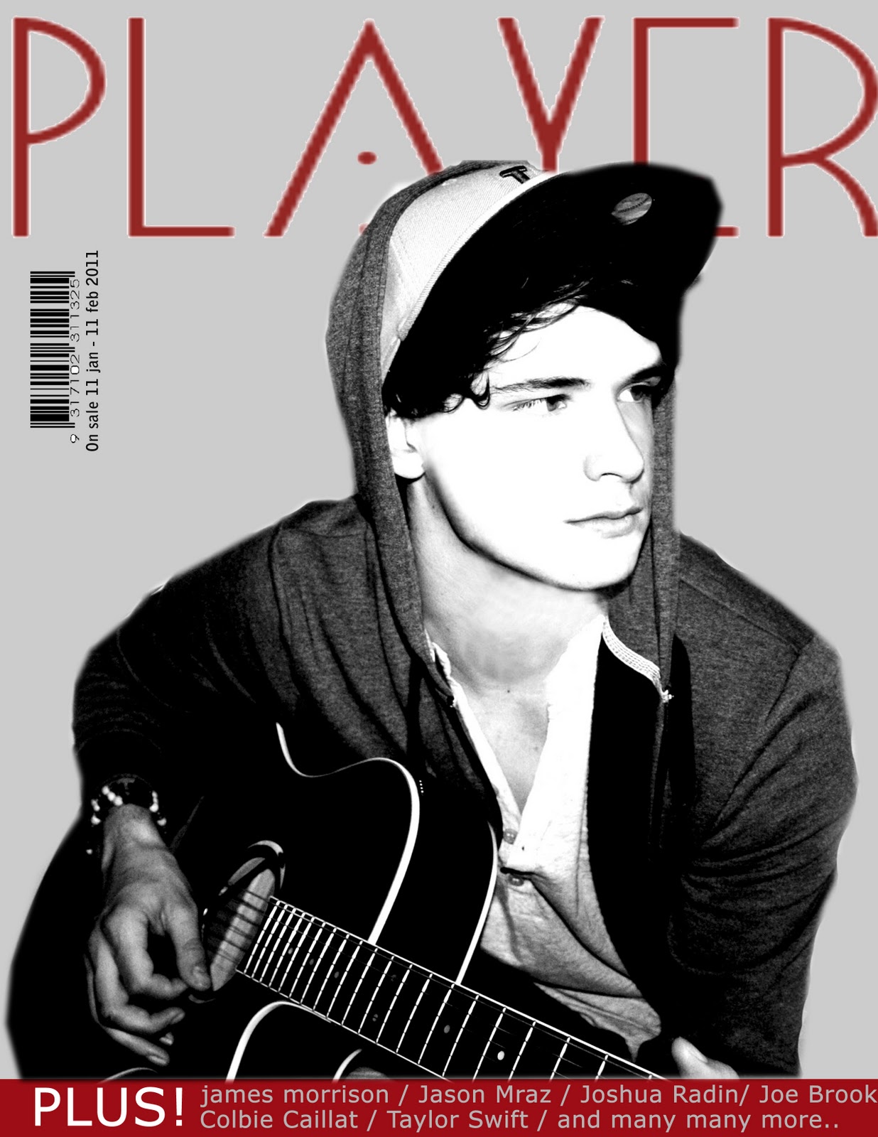
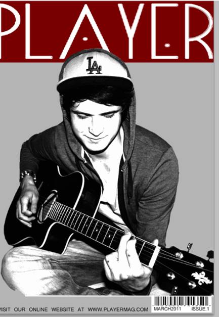
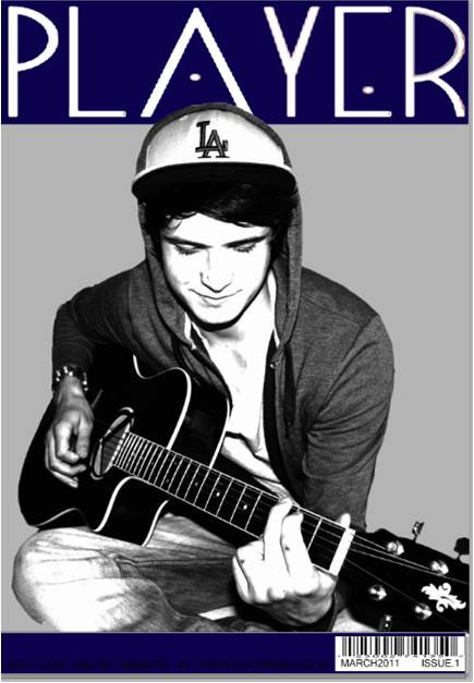
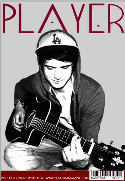
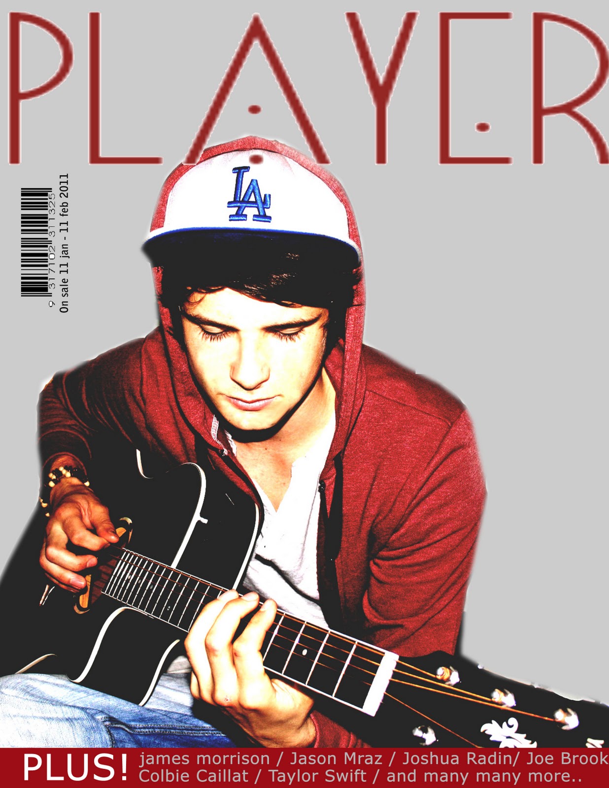
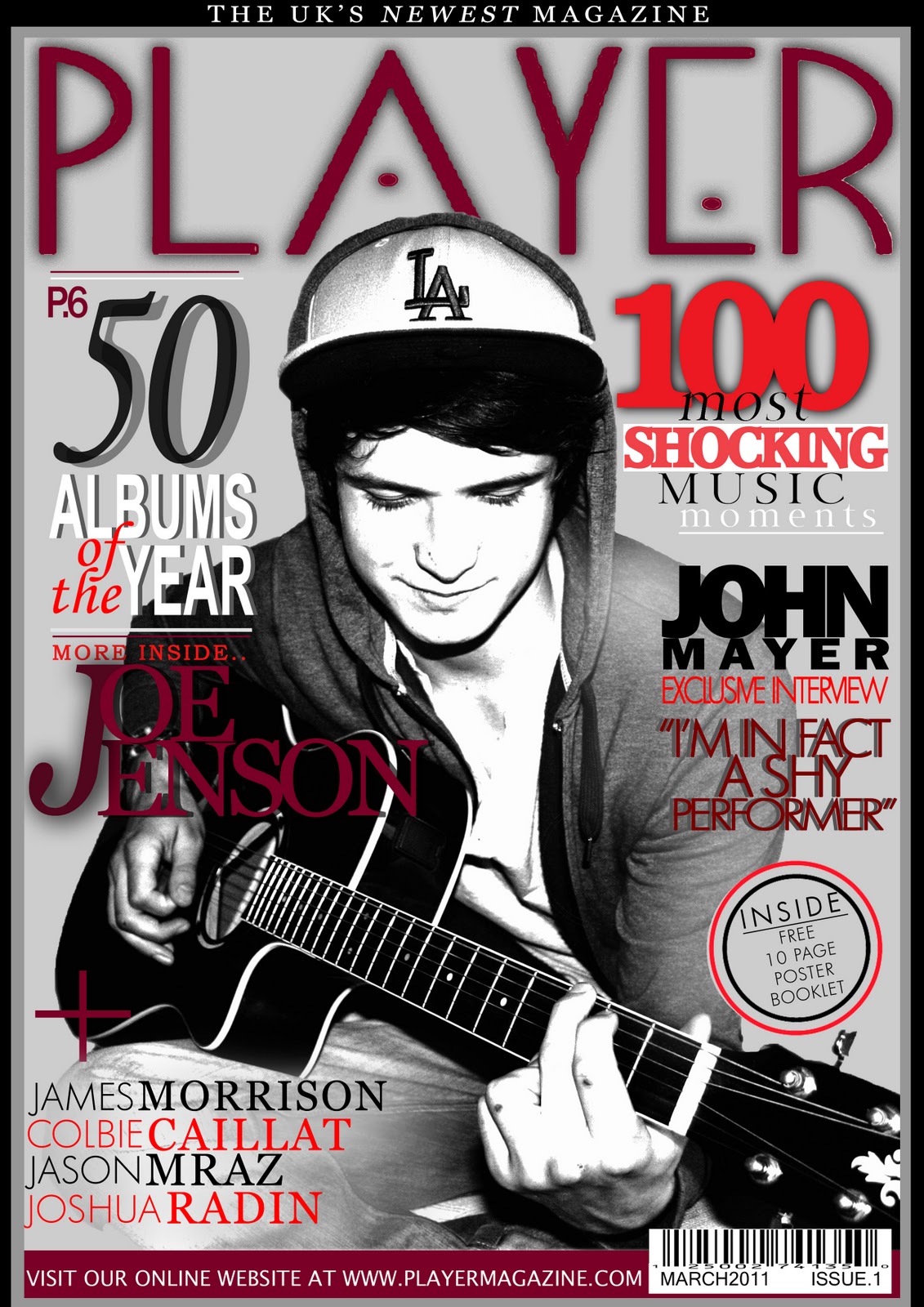 This is my front cover before and after having feedback. I changed a lot about it, like things such as the shadows on the headlines, the border around the edge, the featuring headline, lightening of the image, colour changing etc. I think that it looks better this way and am happy with the outcome.


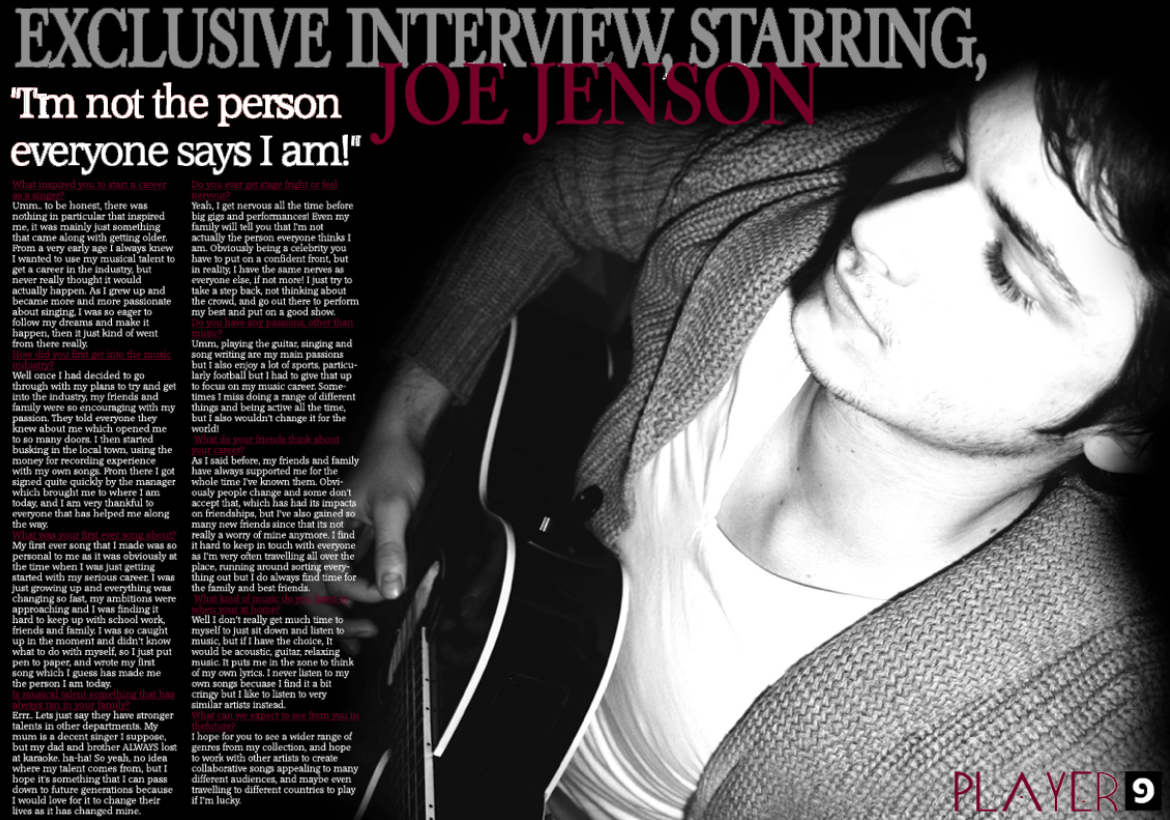


 2.
2.
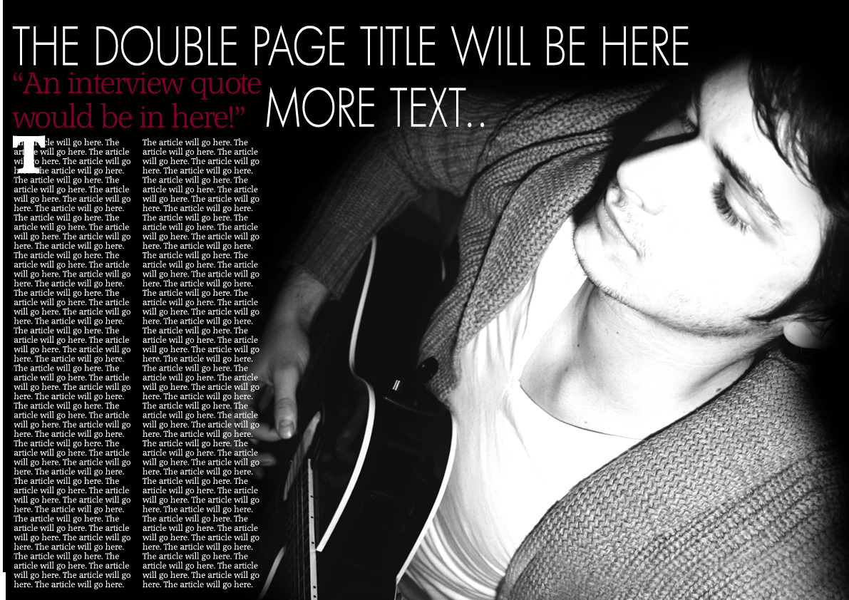
 4.
4.