Danielle Bennett

Hey Guys, welcome to my blog :)

Tuesday 22 March 2011

All 3 pieces


This was my first picture for my contents page, however I didn't think that it looked very striking. So I tried out a different one...

I tried it out with this picture, Which I think looks a lot better. I will get feedback from students and see what I need to add/adapt. 

I then realised that I needed more than one origional image, so I added in two from my previous photoshoot to the bottom of the page, which I think looks better anyway. I also changed the editorial profile so that the writing is slanted now.

Contents Page

Things to put on the contents page:
Features
Every Month
News
Pictures
Reviews
Editors note
Picture of front cover
On the cover;
- 50 albums of the year
- Joe Jenson exclusive interview
- 100 most shocking music moments
- 10 page poster booklet
- John Mayer interview
- Other featured artists


On the cover..
Page 6. 50 albums of the year
Page 9. Joe Jenson - An exclusive interview with Joe Jenson reveals all.
Page 20. 100 shocking music moments - Be the first to see unheard stories in music.
Page 52. 10 page poster book - Your favourite artists at their best.
Page 61. John Mayer - "I'm in fact a shy performer"


Every month..
Page 4. Player Mail
Page 12. Player Top 10 tracks
Page 86. Subscription
Page 102. Crossword
Page 140. Viewers page

My final DPS copy.

Plan

This is my contents page plan.

Monday 21 March 2011

Contents Initial Photographs

Crime Drama

Dani and Jono's Crime Drama!


'Crime Justice' is a crime drama set in London, the fundamental concept driving the ploto this episode is a missing child report, the last time she was seen she was next to the penguin enclosure whilst her mother left her briefly to obtain her daughters dropped jacket. By the time she returned her daughter was gone and the speaker anounced that the park was closing, forcing her to leave and wait for her daughter outside the zoo. After notify security and several hours of searching the zoo, security called the police where 'The Detective'[1] and Roxie [2] found a lock of hair in the woman's toilets basin, which the DNA matches the hair left on the previously dropped jacket, there was also a fingeprint on the mirror of the bathroom, which matches to a woman who was considered a missing person 20 years ago and presumed dead.

[1]
Name: Only known as 'The Detective'. Real name unknown
Role in Crime Drama: Detective
Age: 58
About him: He is an 'old school' veteran in the police force and was moved to the Detective Agency years ago due to his violent and aggressie attitude and lack of consideration towards Police rulebook. He has no family and the closest thing he has to a friend is his assistant Roxie who has helped him solve crimes for the last two years, she keeps The Detective from getting into too much trouble and isn't effected by his arrogance like the other assistants 'The Detective' has had in the past. Although he acts like a stereotypical tough guy bad cop,whenever he's alone he has brief moments where he stares woefully at a picture of his wife and is extremely vulnerable at those moments. He has a serious drinking problem as he became an alcholic twenty years ago after his wife went missing.

[2]
Name: Roxie
Role in Crime Drama: Detectives Assistant
Age: 25
About her: She is Dangerously clever in the way she gets her information, by not playing by the rules set by her superiors. Her determined attitude can sometimes land her into tricky situations, which are overlooked due to the detectives reliance on her unchallenged crime solving abilities. Although she may seem like your typical slut, her inner abilities prove her to be a much more complicated yet illustrious character.

Monday 7 March 2011

DPS After Feedback


I have taken on board the feedback that I got from my class, and come up with this design. I think this looks a lot better than before and will probably keep this as my final draft.

More DPS Feedback

I have had more positive and negative feedback on my DPS, so that I can see what works, and what doesn't from different points of views.


Positive points:
- Eye catching image
- Good house style and matching colours
- Page connoting acoustic genre

Negative points:
- Could make the page number a different colour so that it stands out
- Move the quote to a different place
- Change the article so it has bigger writing
- Change the colour of the questions so that you can see them clearer
             This is my front cover before and after having feedback. I changed a lot about it, like things such as the shadows on the headlines, the border around the edge, the featuring headline, lightening of the image,  colour changing etc. I think that it looks better this way and am happy with the outcome. 
Other positive feedback I had on my front cover included:
- Striking image
- Colours connoting genre
- Looks professional
- The way the person is not making eye contact with the reader works, because of the positioning of the guitar.  

Thursday 3 March 2011

This is my original double page spread, before editing further.

I changed the colour of the title to dark grey, and changed the quote colour to red. I think that the grey colour works, however it may be a bit too dark. I dont think that the red colour works as it clashes with the purple too much.

I kept the title as dark grey, and changed the quote to a white colour. I much prefer the quote in this colour as it stands out from the black and goes well with other colours.


I changed the title colour to light grey as it didnt stand out enough when it was darker. I think this looks much better this way so will keep the changes.


I have changed the font of the page number in the bottom right hand corner as the previous one didnt match the house style. I think this looks much better and will use these colours for the final product. I may experiment with different fonts first, then decide upon a final dps construction.

Dps Feedback

I also got feedback on my Double page spread, however there was not much that was suggested to be changed. 


- I could change the colour of the quote to one which stands out more. 


I will experiment with colours of the text, to see if it will look better, however I think that the colour I have already is good as it fits my house style colour scheme.

Front cover feedback

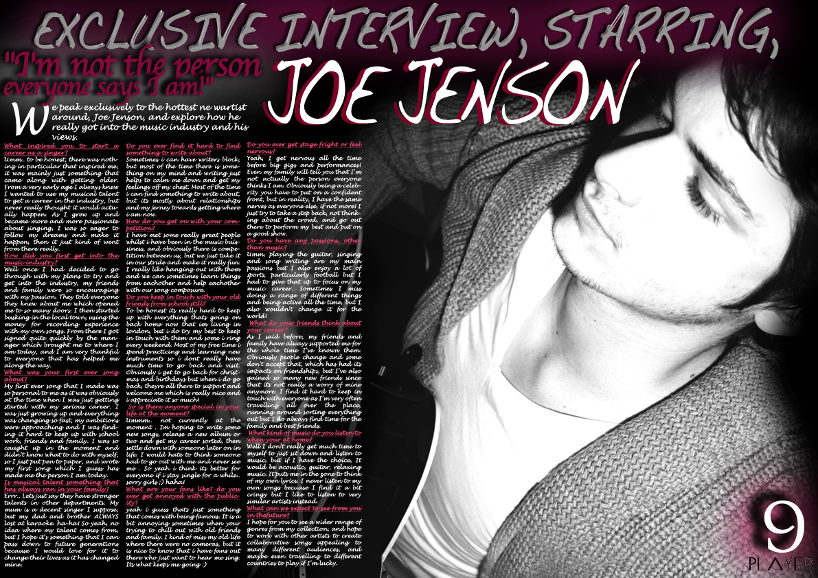
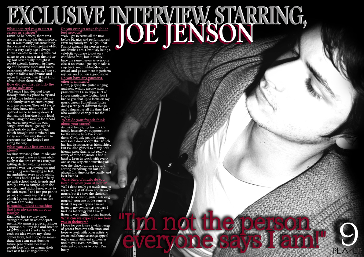
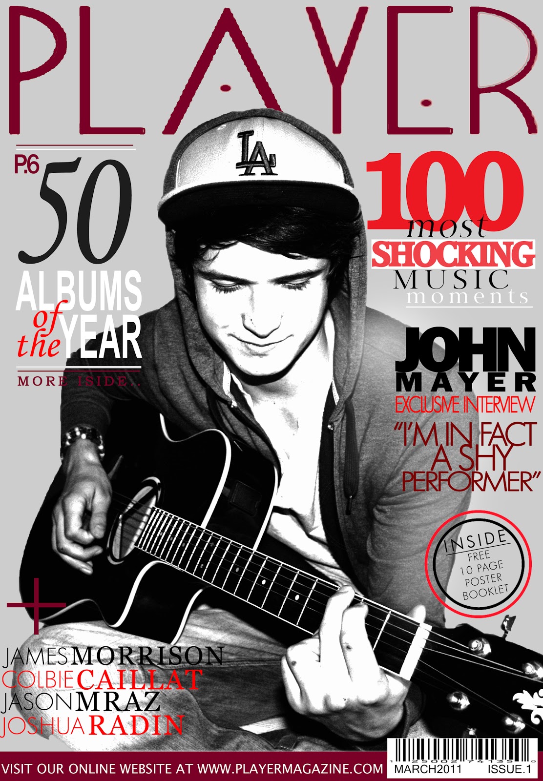
-After finishing my front cover, I decided that I should get some feedback on what others thought I could improve to have a better magazine. Here are some of the suggestions that I got..


-To improve I could put a background colour (either white or grey) on the button to the right of the magazine, so that it stands out more, as the picture in the background gets in the way.


-I could add shadows to the text on the cover, to make it stand out and easier to read. 

-I could change the colour of the 'more inside' piece of text, as it is hard to see as it is currently.


-I could change the colours of other pieces of text so that you can see them more clearly.

-I could add a starring name to the left hand side in the gap, saying who is featured inside and on the cover. I would do this, however I am unsure that it may take focus away from the hand strumming the guitar. I will try this amendment anyway, just to see if it looks better anywhere.

-I have also since thought about adding a border around my cover, like Q magazine so that it brings the whole cover together. I will try out this idea and then see what it looks like.


I will take on board these comments, and try them out. If I don't like the end product with the changes, I will leave it as it is.